Fall 2019 ~ Current
Members: Ameya Patil, Junran Yang, Sai Yerramreddy, Abhilasha Sancheti, Leilani Battle, Remco Chang, Michael Stonebraker
Interactive data visualization and analysis tools have greatly facilitated the process of extracting insights from any kind of dataset. These tools generally use a client-server architecture where the data is stored on a DBMS and is queried by the user via a client machine. Such a design also allows collaborative concurrent data exploration among multiple users. However, DBMSs are not usually designed for responding to user queries at interactive speeds. Further, some queries are very complex to return results at interactive speeds. This can introduce latency in the tool and hamper the data exploration experience. To facilitate a low-latency query response, we explore and evaluate cache-sharing strategies to exploit possible overlaps between the queries of multiple concurrent users, and control data retrieval and storage for all the users. We propose and study the use of neural networks for next interaction predictionto pre-fetch data and reduce response times. We evaluate a partitioned design for the cache manager to handle both the user requested and pre-fetched data for concurrent multi-user exploration scenarios. We present our findings as guidelines for building efficient systems in the multi-user context, and show results from our implementation based on these guidelines.
Fall 2019 ~ Current
Members: Zehua Zeng, Minhui Xie, Phoebe Moh, Leilani Battle, Tak Yeon Lee, Fan Du, Eunyee Koh, Sana Malik
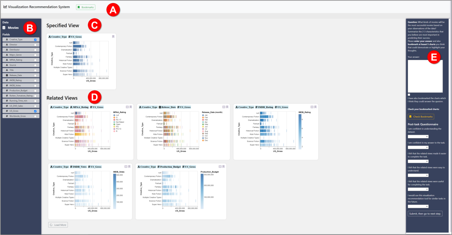
Although numerous existing research on visualization recommendation aims to improve data exploration within the process of analysis, our community lacks a consistent framework for recommendation systems. In this paper, we construct a general-purpose framework to define a broad range of recommendation strategies for visualization recommendation systems. We present the design of our framework, which includes (1) the visualization search space, (2) the graph traversal method, and (3) the oracle for ranking visualizations/paths. To demonstrate the expressivity of the framework, we describe existing recommendation systems with our purposed framework. Finally, we evaluate the ability of different recommendation algorithms (different combinations of oracle and traversal methods) to support both focused- and open-ended- oriented analysis.
Summer 2019 ~ Current
Members: Joanna Purich, Urisha Kreem, Leilani Battle
Past Members: Chidi Udeze, Shriya Sharma
Interactive analysis systems provide efficient and accessible means by which users of varying technical experience can comfortably manipulate and analyze data using interactive widgets. Widgets are elements of interaction within a user interface (e.g. scrollbar, button, etc). Interactions with these widgets produce database queries whose results determine the subsequent changes made to the current visualization made by the user. In this paper, we present a tool that extends IDEBench to ingest visualization interfaces and a dataset, and estimate the expected database load that would be generated by real users. Our tool analyzes the interactive capabilities of the visualization and creates the queries that support the various interactions. We began with a proof of concept implementation of every interaction widget, which led us to define three distinct sets of query templates that can support all interactions. We then show that these templates can be layered to imitate various interfaces and tailored to any dataset. Secondly, we simulate how users would interact with the proposed interface and report on the strain that such use would place on the database management system.
Summer 2019 ~ Current
Members: Deepthi Raghunandan, Leilani Battle, Niklas Elmqvist, Tejaswi Shrestha, Kartik Krishnan, Segen Tirfe, Shenzhi Shi
Past Members: Rachael Zehrung
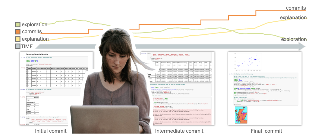
The advent of open source computational notebooks has changed the landscape for analysts looking to document visualizations, code, and annotate various stages of the analysis process under one platform. The use of GitHub in conjunction with computational notebooks provides a unique opportunity to study the data analysis process over time. We present a threepart quantitative study that examines process-based data science workflows in the context of Jupyter notebooks. The first study demonstrates how to identify correlations between a user’s data analysis behavior and observable GitHub interactions. The second study establishes a methodology by which data science workflows can be characterized within notebooks: in particular, exploration and explanation. In the last study, we apply this methodology to investigate shifts in workflows across time. All three parts examine the evolving role of visualization from exploration and analysis to communication and documentation. We use these observations as an opportunity to encourage a design/re-design of data science and visualization tools to better support process-based workflows.
Summer 2019 ~ Current
Members: Astha Singhal, Sarah Agarrat, Michael Correll, Leilani Battle
Past Members: Rachael Zehrung
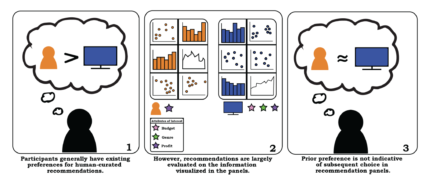
More visualization systems are simplifying the data analysis process by automatically suggesting relevant visualizations. However, little work has been done to understand if users trust these automated recommendations. In this paper, we present the results of a crowd-sourced study exploring preferences and perceived quality of recommendations that have been positioned as either human-curated or algorithmically generated. We observe that while participants initially prefer human recommenders, their actions suggest an indifference for recommendation source when evaluating visualization recommendations. The relevance of presented information (e.g., the presence of certain data fields) was the most critical factor, followed by a belief in recommender’s ability to create accurate visualizations. Our findings suggest a general indifference towards the provenance of recommendations, and point to idiosyncratic definitions of visualization quality and trustworthiness that may not be captured by simple measures. We suggest that recommendation systems should be tailored to the information-foraging strategies of specific users.
Summer 2019 ~ Current
Members: Zehua Zeng, Minhui Xie, Leilani Battle
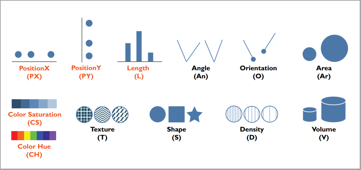
A growing body of research focuses on helping users explore complex datasets faster by automatically suggesting visualization designs of possible interest. However, our community lacks a consistent framework through which to evaluate the visualization design rankings produced by these automated systems, as well as the visualization theory and experimental results that belie these designs. In this paper, we present a review of the literature in comparing and ranking the quality of visualization designs with respect to visual perception and human performance. We structure our review by first presenting a concrete framework for computing the relevant visualization design space, and enumerating the visualization designs that must be compared within this space to recommend effective visualization designs. We then analyze the literature in terms of coverage: how much of the design space has been thoroughly evaluated, enabling us to provide systematic and evidence-based design recommendations? We find huge gaps in existing theory and empirical results, where only a small number of encoding channels—particularly position and length—seem to be thoroughly compared in the literature. Based on our findings, we highlight new opportunities and challenges for the community in working towards constructing holistic evaluation frameworks for automated visualization design.
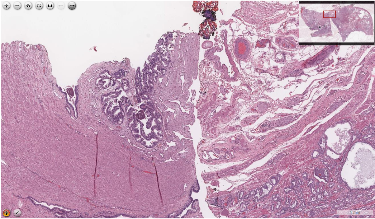
Spring 2019 ~ Current
Members: Ameya Patil, Huimin Zhuge, J Quincy Brown, Brian Summa, Leilani Battle
Digital pathology is on the rise owing to its advantage of betterand faster collaboration among pathologists all over the world. It makes use of super-resolution whole slide images of tissues, which are maintained on a centralized server and accessed by pathologists over the internet, using a client computer. However, the huge memory footprint of these images makes it difficult to fit the entire image in the main memory of the client computer at a time. Thus parts of the image need to be fetched from the server, on demand. Further, it is necessary to perform this transfer of data over the network with low latency, so as to have a smooth examination experience. To facilitate such a low latency data transfer, we explore possible common search patterns and strategies that pathologists employ intheir examinations. Based on this knowledge, we aim to understand the behaviour patterns of the pathologists, correctly predict thenext action and pre-fetch the required data before hand, so as to have lower turn around time, efficient usage of main memory and thus better user experience. We employ memory based neural networks - LSTM for next action prediction; analyse the results for some common navigation patterns and some possible enhancements in whole slide image analysis tools based on these observations.
Spring 2019 ~ Current
Members: Deepthi Raghunandan, Leilani Battle, Niklas Elmqvist, Tejaswi Shrestha, Kartik Krishnan, Segen Tirfe, Shenzhi Shi
Past Members: Rachael Zehrung, Jason Lim, Zhe Cui
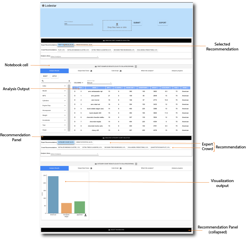
Keeping abreast of current trends, technologies, and best practices in statistics, visualization, and data analysis is becoming increasingly difficult even for professional data scientists, and is a hopeless endeavor for domain experts lacking time and training. In this paper, we propose Lodestar, an interactive visualization sandbox that allows users to perform visual data analysis simply by selecting from a list of recommendations. Choosing a recommendation adds the corresponding Python code to the notebook and executes it, thus generating new output. The recommendation engine is inspired by autocomplete mechanisms, where a partial query is used to show suggestions for how to finish it. In our implementation, we derive our recommendations from a directed graph of analysis states: one manually curated from online data science tutorials, another by automatically analyzing the Python code from a corpus of approximately 6,000 Jupyter notebooks on data science. We evaluated Lodestar through a two-phase evaluation sequence: a formative study guiding our next set of improvements to the tool, followed by a summative study assessing its utility for novice data scientists.
Spring 2018 ~ Current
Members: Hannah Bako, Alisha Varma, Anu Faboro, Mahreen Haider, Leilani Battle
Past Members: Arjun Nair, Kelli Webber, Rishik Narayana, Danni Feng
Publication - 2018 CHI Conference, Pages 1-8
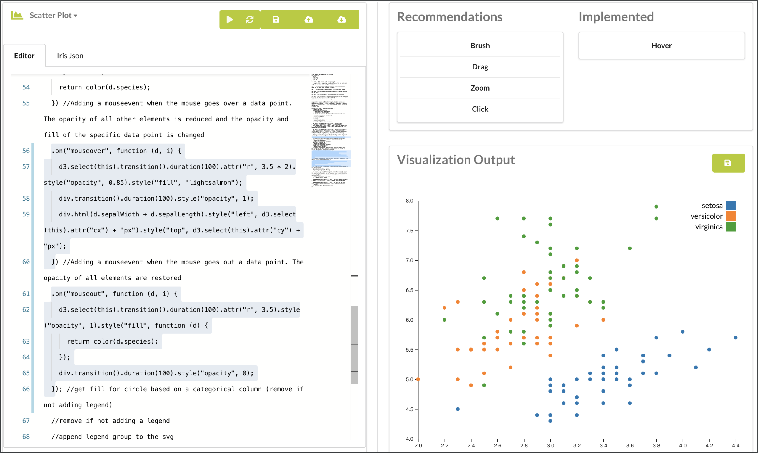
With the adoption of visualizations as a means of communication in various industries, thousands of visualizations have been created and are available of the World Wide Web. The Beagle Project’s focus is on analyzing these visualizations to 1) understand how these visualizations are created and applied. 2) Understand the challenges involved in creating these visualizations. 3) To assess how users goals can be supported through automated tools. Over the years, there have been 3 phases of this project. The first phase aimed to quantify and assess how interactive visualizations are used by visualization architects on the web. The Beagle tool extracted SVG visualizations from popular visualization sharing websites. It exploits the unique positioning and characteristics of visualizations marks to extract features and couples this with Machine Learning techniques to label these visualizations with a 97% accuracy. Given the popularity of D3 visualizations among the extracted SVG’s analyzed in the first project, the second phase focused on analyzing how D3 users reason about and use its framework. This was done by assessing how users describe their challenges and reasoning process on multiple online communities such as Stackoverflow and Reddit.
The results of these two phases highlighted both the dominance of D3.js as a tool for the creation of complex and interactive visualizations as well as its steep learning curve. Past research has also highlighted a culture of visualization architects modifying existing examples to create their own visualizations. The current phase of the Beagle project leverages all of these findings to analyze a corpus of D3 visualizations scrapped from Bl.ocks.org in order to understand what programming techniques visualization architects use in creating these visualizations. We aim to strike a balance between automated guidance and user agency by first deriving a model of how visualization designers use manual specification languages–specifically D3–to develop new visualization designs. Subsequently, we explore the application of this model in an online tool that assists developers to create visualizations via informed recommendations. Finally, we apply programming language theory to effect the direct manipulation and fitting of a users code based on their specified design goals.
Fall 2017 ~ Current
Members: Hao Cheng, Leilani Battle
Past Members: Yukun Zheng, BJ Sallah, Yinan Chen, Pooja Gada
Publication - SIGMOD 2020, Pages 1571-1587
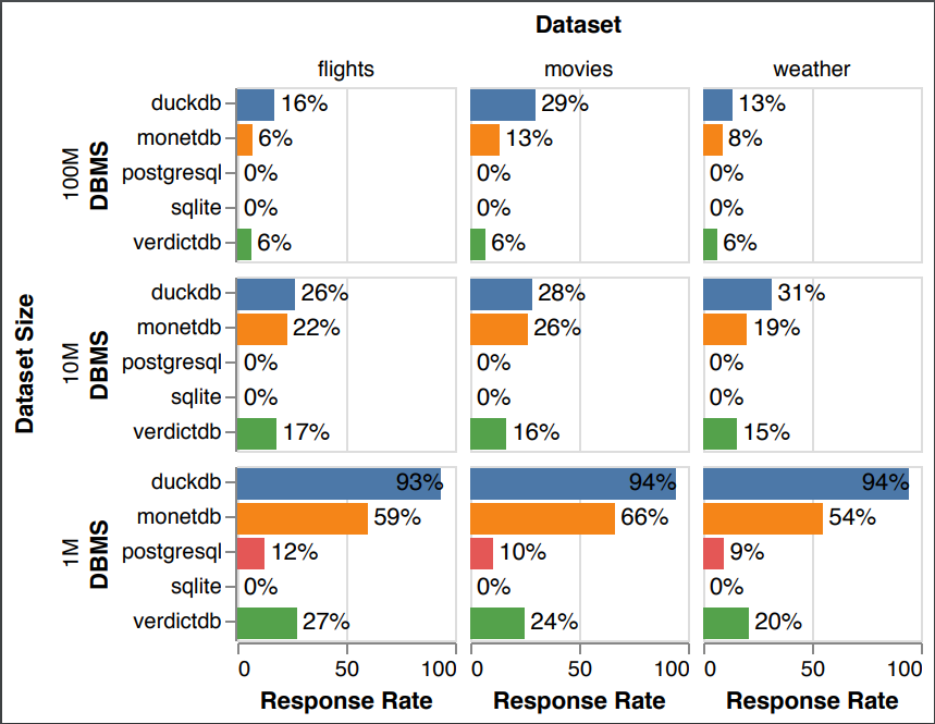
In this paper, we present a new benchmark to validate the suitability of database systems for interactive visualization workloads. While there exist proposals for evaluating database systems on interactive data exploration workloads, none rely on real user traces for database benchmarking. To this end, our long term goal is to collect user traces that represent workloads with different exploration characteristics. In this paper, we present an initial benchmark that focuses on “crossfilter”-style applications, which are a popular interaction type for data exploration and a particularly demanding scenario for testing database system performance. We make our benchmark materials, including input datasets, interaction sequences, corresponding SQL queries, and analysis code, freely available as a community resource, to foster further research in this area: https://osf.io/9xerb/?view_only=81de1a3f99d04529b6b173a3bd5b4d23.
Spring 2019 ~ Summer 2020
Members: Sneha Gathani, Daniel Votipka, Kartik Krishnan, Kristopher Micinski, Jeffrey Foster, Michelle Mazurek, Leilani Battle
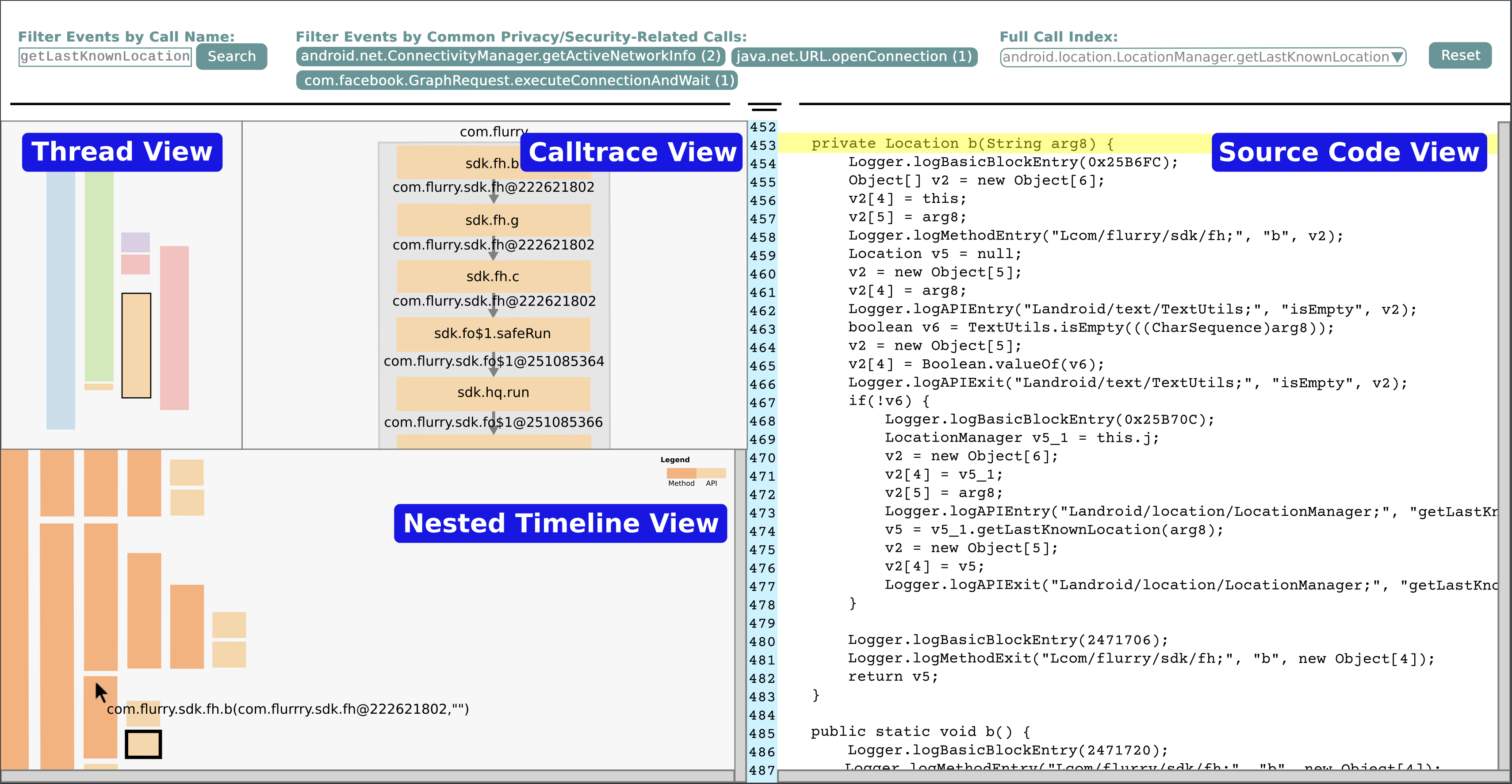
Visualization design studies are notoriously difficult to design effectively. Though existing models highlight the major pitfalls, their guidance is not as user-friendly for individuals new to design studies. We present an updated design study model providing step-by-step guidelines, concrete examples, and discussion of differences and similarities between design studies in eight different domains. To demonstrate the value of our model and guidelines, we apply them in the security domain to help fledgling analysts reverse engineer (RE) Android applications (apps) for potential security and privacy vulnerabilities. Through our design study, we develop TraceInspector, an interactive visualization tool that integrates both static and dynamic Android app data, connects relevant temporal event sequences and method dependencies, and executes app code in a single visualization interface. Finally, we evaluate TraceInspector with nine RE users and find that the tool eases the learning of RE tasks for novice RE users, validating our synthesized design study guidance.
Spring 2019 ~ Fall 2019
Members: Sneha Gathani, Peter Lim, Leilani Battle
Publication - 2020 CHI Conference, Pages 1-16
Database management systems (or DBMSs) have been around for decades, and yet are still difficult to use, particularly when trying to identify and fix errors in user programs (or queries). We seek to understand what methods have been proposed to help people debug database queries, and whether these techniques have ultimately been adopted by DBMSs (and users). We conducted an interdisciplinary review of 112 papers and tools from the database, visualization and HCI communities. To better understand whether academic and industry approaches are meeting the needs of users, we interviewed 20 database users (and some designers), and found surprising results. In particular, there seems to be a wide gulf between users’ debugging strategies and the functionality implemented in existing DBMSs, as well as proposed in the literature. In response, we propose new design guidelines to help system designers to build features that more closely match users debugging strategies.